Guillotine Menu Animation on Android
Recently I came across a very nice article about creating Guillotine menu animation on Android. Being a developer with great interest in animation, I was naturally curious about how it was implemented and how to bring its idea to apps that I would develop. I then ended up with a fairly different implementation which I’m going to share to you today.


The first GIF shows what the other article introduced and the second one shows what I achieved. In comparison to the other article’s implementation, my one has the following key differences:
- The other implementation has the hamburger icon on the toolbar stays in the 90 degree position (|||) after the menu is closed. I personally prefer it to become a back arrow to better indicating that tapping on the icon would show the menu again. I thus created a morphing animation to transform the hamburger to the back arrow when the menu is closed and the back arrow to the hamburger icon when the menu is opened. Animated vector drawables are used to achieve this.
- The other implementation has the bouncing interpolator created only for a specific bouncing angle and duration. I worked out a generic Math formula to provide a generic interpolator that work with any angle and duration.
- The other implementation (perhaps because it was just a brief demo) has the menu created as a view attached on top of a specific activity and clicking on the hamburger icon would animate the menu view to reveal the activity underneath. This is not a natural behaviour since the activity should be displayed only after a menu item is tapped (not the burger icon). It is also not clear how different views are shown when different menu items are tapped in their provided demo. My implementation provides a clear example that shows the navigation from the menu view to and from feature views.
It’s worth mentioning that this post by no mean is written to criticise the other article. It is only for the purpose of sharing my approach to guillotine menu animation which someone might find useful.
Implementation details
My implementation was written in Kotlin. It also relies on a number of libraries/frameworks: RxJava, RxBinding, Kotterknife and Conductor. We obviously don’t need any of those for this example. But if you are not familiar with them, I would strongly recommend you to have a look since they are all very nice stuff to play with. If you haven’t use Conductor before, I’d like to refer you to my previous posts on Conductor.
Although Conductor was used for organising views/screens in this example, most of the techniques presented here can be reused to reimplement the animation in a non-Conductor way.
Two phases of animation
There are 3 Conductor’s controllers that correspond to the menu (home), music, and video views (call them feature view in this example). The ChangeHandler between the home view and each of the feature views is responsible for providing the guillotine animation.
The menu closing animation is made up of two phases. The first phase is when the menu view is animated (rotated 90 degree anticlockwise). In the second phase, the menu view is removed from the screen and the toolbar of one of the feature views (depending on what menu item is tapped) is animated (it bounces 2 times and also has its navigation icon animated from the hamburger to the back arrow). The menu opening animation also has those 2 phases with movements in the opposite direction.
The below figure illustrates how the entire animation looks like.
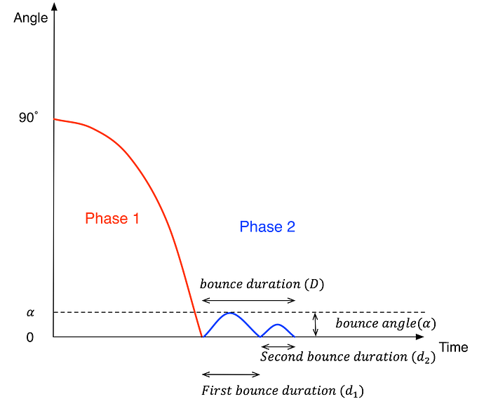
One interpolator is needed for each phase of the animation. An acceleration interpolator is suitable for the first phase since it make the movement looks natural: the guillotine would be slowly moving out of its start position and gradually accelerate until it reaches the end position (before bouncing a bit). Therefore, I use the standard acceleration interpolator for this first phase:

With the assumption that the maximum bouncing angle of the second bounce is always half of the maximum angle of the first bounce, I’ve worked out the following formula for the second phase’s interpolators. Please see the figure above for the meaning of the parameters.
Base on the above formulas, the implementation of the interpolators is as simple as follows. MenuAccelerateInterpolator is for phase 1 and MenuBounceInterpolator is for phase 2.
private const val GUILLOTINE_CLOSED_ANGLE = -90f
private const val GUILLOTINE_OPENED_ANGLE = 0f

// Feel free to modify these values (of course they need to be meaningful) to try different animation effects.
private const val ACCELERATE_DURATION = 290L
private const val BOUNCE_DURATION = 335L
private const val FIRST_BOUNCE_RATIO = 0.625f
private const val BOUNCE_ANGLE = 2fclass MenuAccelerateInterpolator : Interpolator {
    override fun getInterpolation(input: Float) = Math.pow(input.toDouble(), 2.0).toFloat()
}

class MenuBounceInterpolator : Interpolator {

    override fun getInterpolation(input: Float): Float {
        if (input < FIRST_BOUNCE_RATIO) return firstBounce(input)
        return secondBounce(input)
    }

    private fun firstBounce(input: Float): Float {
        return (-4f * BOUNCE_ANGLE / Math.pow(FIRST_BOUNCE_RATIO.toDouble(), 2.0).toFloat()) * Math.pow(input.toDouble(), 2.0).toFloat() + (4f * BOUNCE_ANGLE / FIRST_BOUNCE_RATIO) * input
    }

    private fun secondBounce(input: Float): Float {
        return ((-2 * BOUNCE_ANGLE / (Math.pow(1.0 - FIRST_BOUNCE_RATIO.toDouble(), 2.0))) * Math.pow(input.toDouble(), 2.0)).toFloat() +
                (2 * BOUNCE_ANGLE * (FIRST_BOUNCE_RATIO + 1f) / (Math.pow(1.0 - FIRST_BOUNCE_RATIO.toDouble(), 2.0)) * input).toFloat() +
                (-2 * BOUNCE_ANGLE * FIRST_BOUNCE_RATIO / (Math.pow(1.0 - FIRST_BOUNCE_RATIO.toDouble(), 2.0))).toFloat()
    }
}
Menu Screen (Home Screen)
The implementation of HomeController and HomeView are as follows.
home.xml
<net.huannguyen.guillotinemenu.ui.HomeView
    ...

    <net.huannguyen.guillotinemenu.ui.widget.AnimatedToolbar
        android:id="@+id/toolbar"
        android:layout_width="match_parent"
        android:layout_height="wrap_content"
        style="@style/Toolbar"/>

    <Space
        android:layout_width="match_parent"
        android:layout_height="0dp"
        android:layout_weight="1"/>

    <TextView
        android:id="@+id/music"
        style="@style/HomeMenuItem"
        android:drawableStart="@drawable/ic_music_menu"
        android:text="@string/music_menu" />

    <TextView
        android:id="@+id/video"
        style="@style/HomeMenuItem"
        android:drawableStart="@drawable/ic_video_menu"
        android:text="@string/video_menu" />

    ...
</net.huannguyen.guillotinemenu.ui.HomeView>
class HomeController : Controller() {

    private val disposables = CompositeDisposable()

   ...

    override fun onAttach(view: View) {
        fun pushController(controller: Controller) {
            router.pushController(RouterTransaction.with(controller)
                    .pushChangeHandler(MenuCloseChangeHandler())
                    .popChangeHandler(MenuOpenChangeHandler()))
        }

        disposables += (view as HomeView).musicClicks.subscribe {
            pushController(MusicController())
        }

        disposables += (view as HomeView).videoClicks.subscribe {
            pushController(VideoController())
        }
    }

    override fun onDetach(view: View) {
        disposables.clear()
    }
}

class HomeView(context: Context, attributeSet: AttributeSet) : LinearLayout(context, attributeSet), MenuView {
    private val toolbar by bindView<AnimatedToolbar>(R.id.toolbar)
    private val musicMenuItem by bindView<TextView>(R.id.music)
    private val videoMenuItem by bindView<TextView>(R.id.video)

    val musicClicks: Observable<Unit>
        get() = musicMenuItem.clicks()

    val videoClicks: Observable<Unit>
        get() = videoMenuItem.clicks()    override fun onFinishInflate() {
        super.onFinishInflate()
        toolbar.setMode(ToolbarMode.MODE_BURGER)
        globalLayouts().take(1).subscribe {
           val toolbarIconView = toolbar.getNavigationIconView()
           pivotX = (toolbarIconView.left +toolbarIconView.width/2)
                    .toFloat()
           pivotY = (toolbarIconView.top + toolbarIconView.height/2)
                    .toFloat()        }
    }    ....
}
There are a few things to note from the code.
- A custom
AnimatedToolBaris used as a toolbar in the menu view. Its purpose is to provide the morphing animation of the toolbar navigation icon (burger to back arrow and vice versa). MenuCloseChangeHandleris used whenever the home view is popped and a feature view (either music or video) is pushed.MenuOpenChangeHandleris used when the home view is pushed. TheseChangeHandlersare the places where the guillotine animations are hosted.- Since the menu view is supposed to be rotated 90 degree in the animation with its toolbar’s navigation icon remains at the same position, the view’s pivot point is set at the centre point of the navigation icon.
Animated Toolbar
This is a custom toolbar which has its navigation icon animatable using animated vector drawable. The below GIF shows exactly the role of the animated toolbar in this guillotine animation. As can be seen, after the menu is rotated to close in the first phase of animation, its hamburger navigation icon is also rotated 90 degree anticlockwise. When the toolbar of the music view (which has the back arrow as its navigation icon) comes in in the second phase, the animation does not look smooth since it looks like the 90 degree rotated hamburger icon immediately becomes the back arrow. It would be much more meaningful to users if they can see a transition between the icons.
Animated navigation icons are even more important in the opposite animation when the menu is reopened. This time, the “up” arrow (because the back arrow is rotated 90 degree clockwise) has to be transformed back into the hamburger icon.
Animated vector drawables are used to achieve the mentioned animations. If you are not familiar with this topic, I strongly recommend you to have a look. Here is one of my favourite articles. But certainly there are many other nice ones.
For readability reasons, I only briefly include the implementation of the transformation from the “vertical” hamburger icon to the back arrow below.
ic_burger_vertical.xml
<vector xmlns:android="http://schemas.android.com/apk/res/android"
    android:height="24dp"
    android:viewportHeight="24.0"
    android:viewportWidth="24.0"
    android:width="24dp">

    <group android:name="burger_vertical"
        android:pivotX="12"
        android:pivotY="12">
        <path
            android:name="path_left"
            android:fillColor="@android:color/white"
            android:pathData="M6,3 L8,3 L8,21 L6,21z"/>
        <path
            android:name="path_middle"
            android:fillColor="@android:color/white"
            android:pathData="M11,3 L12,3 L13,3 L13,21 L11,21z"/>

        <path
            android:name="path_right"
            android:fillColor="@android:color/white"
            android:pathData="M16,3 L18,3 L18,21 L16,21z"/>
    </group>
</vector>ic_burger_to_arrow.xml
<animated-vector
    xmlns:android="http://schemas.android.com/apk/res/android"
    android:drawable="@drawable/ic_burger_vertical">
    <target
        android:name="burger_vertical"
        android:animation="@animator/rotate_minus_90" />
    <target
        android:name="path_left"
        android:animation="@animator/upper_burger_to_arrow" />
    <target
        android:name="path_middle"
        android:animation="@animator/middle_burger_to_arrow" />
    <target
        android:name="path_right"
        android:animation="@animator/lower_burger_to_arrow" />
</animated-vector>upper_burger_to_arrow.xml
<objectAnimator
    xmlns:android="http://schemas.android.com/apk/res/android"
    android:duration="@android:integer/config_shortAnimTime"
    android:propertyName="pathData"
    android:valueFrom="M6,3 L8,3 L8,21 L6,21z"
    android:valueTo="M11,5 L11,7.83 L5.41,13.41 L4,12z"
    android:valueType="pathType" />middle_burger_to_arrow.xml
<objectAnimator
    xmlns:android="http://schemas.android.com/apk/res/android"
    android:duration="@android:integer/config_shortAnimTime"
    android:propertyName="pathData"
    android:valueFrom="M11,3 L12,3 L13,3 L13,21 L11,21z"
    android:valueTo="M11,5 L12,4 L13,5 L13,20 L11,20z"
    android:valueType="pathType" />lower_burger_to_arrow.xml
<objectAnimator
    xmlns:android="http://schemas.android.com/apk/res/android"
    android:duration="@android:integer/config_shortAnimTime"
    android:propertyName="pathData"
    android:valueFrom="M16,3 L18,3 L18,21 L16,21z"
    android:valueTo="M13,7.83 L13,5 L20,12 L18.59,13.41z"
    android:valueType="pathType" />
Finally, the ChangeHandlers!
Now that we have had everything we need (interpolators and animated toolbar), it’s time to wire all of them together to build the guillotine animation.
MenuCloseChangeHandler
class MenuCloseChangeHandler : AnimatorChangeHandler() {

    override fun getAnimator(container: ViewGroup, from: View?, to: View?, isPush: Boolean, toAddedToContainer: Boolean): Animator {
        if (from == null || to !is FeatureView) {
            throw IllegalArgumentException("The 'from' view must be non null. The 'to' view must be a FeatureView")
        }

        val menuCloseAnimator = ObjectAnimator.ofFloat(from, ROTATION, GUILLOTINE_OPENED_ANGLE, GUILLOTINE_CLOSED_ANGLE).apply {
            duration = ACCELERATE_DURATION
            interpolator = MenuAccelerateInterpolator()
            setListeners(onEnd = {
                from.alpha = 0f
                to.playMenuCloseIconAnim()
            })
        }

        val toolbarAnimator = ObjectAnimator.ofFloat(to.toolbar, ROTATION, GUILLOTINE_OPENED_ANGLE, BOUNCE_ANGLE).apply {
            duration = BOUNCE_DURATION
            interpolator = MenuBounceInterpolator()
        }

        return AnimatorSet().apply {
            playSequentially(menuCloseAnimator, toolbarAnimator)
        }
    }
    ...
}
As can be seen, the Animator includes 2 sub-animators corresponding to 2 animation phases. At the end of the first phase, the menu view is hidden away so that the feature view’s toolbar is visible and starts its navigation icon’s animation. Note here that the durations of the bouncing animation and the icon animation need to be selected so that they could play well with each other (e.g., avoid cases like the bouncing animation finishes long time before the icon animation is complete).
The MenuOpenChangeHandler is done in a similar approach.
MenuOpenChangeHandler
class MenuOpenChangeHandler : AnimatorChangeHandler() {

    override fun getAnimator(container: ViewGroup, from: View?, to: View?, isPush: Boolean, toAddedToContainer: Boolean): Animator {
        if (from == null || to !is MenuView) {
            throw IllegalArgumentException("The 'from' view must be non null. The 'to' view must be MenuView.")
        }

        val menuOpenAnimator = ObjectAnimator.ofFloat(to, ROTATION, GUILLOTINE_CLOSED_ANGLE, GUILLOTINE_OPENED_ANGLE).apply {
            duration = ACCELERATE_DURATION
            interpolator = AccelerateInterpolator()
            setListeners(onStart = { to.onMenuOpenAnimStart() },
                         onEnd = { to.playMenuOpenIconAnim() })
        }

        val menuBounceAnimator = ObjectAnimator.ofFloat(to, ROTATION, GUILLOTINE_OPENED_ANGLE, -BOUNCE_ANGLE).apply {
            duration = BOUNCE_DURATION
            interpolator = MenuBounceInterpolator()
        }

        return AnimatorSet().apply {
            playSequentially(menuOpenAnimator, menuBounceAnimator)
        }
    }
    ...
}
That’s it. I hope you enjoy the post. The source code is here so you can have a look and play with. One disadvantage with this approach is that it currently only works on API 21+ due to the use of animated vector drawable which is not properly supported by the appcompat library (mentioned in a Chris Banes’s post). An alternative way of implementing animated navigation icons without vector drawables (and thus working on pre-Lollipop) that I haven’t investigated yet is to create a custom Drawable that can take in some state setting and redraw itself according to its current state, as can be seen in DrawerArrowDrawable.
Finally I also want to take this chance to thank to the team at Yalantis who designed such a nice animation.

