Android Tools Attributes — Hidden Gems of Android Studio

Probably most of you have already seen and even used the weird XML attributes with tools: prefix while designing the app layouts in Android Studio. Personally, I was using tools:text attribute a lot in places where text should be added dynamically at a runtime and therefore using android:text attribute wasn’t feasible.
However, my relationships with this powerful tool didn’t go beyond tools:text, tools:visibility and tools:context attributes until few months ago I encountered a problem while designing the layout of my personal app project. The view block below the <RecyclerView> was not visible in layout preview because the <RecyclerView> was covering the layout screen. While searching for the solution I found myself reading the official user guide of tools attributes published in Android Developers’ website. After reading the guide I realized that, I was underestimating this tool for a very long time and found out that this tool can help me a lot to precisely visualize my layouts directly from within the preview pane of Android Studio.
As you may already understand, today I want to tell you about tools attributes. So, let’s start diving deeper and getting a better understanding of how these attributes work and how they can simplify our mortal lives.
General Overview
First thing first! Before going into details I would like to give a brief overview of tools attributes and explain how to use them.
Generally speaking, tools attributes are special XML attributes that enable not only design-time features (such as which layout should be drawn inside the fragment), as well as compile-time behavior (such as suppressing lint warnings).
According to the official user guide, these attributes are used solely by Android Studio and removed by build tools at build time of the app. So, using these attributes has no impact on your APK size or runtime behavior.
To use these attributes, tools namespace should be added to the root element of XML file, as shown below:
<RootTag xmlns:android=”http://schemas.android.com/apk/res/android"
 xmlns:tools=”http://schemas.android.com/tools" >
Based on the function that the attribute accomplishes we can divide tools attributes into 3 categories:
- Error handling attributes
—used for suppressing lint warning messages. This category consist of following attributes:
tools:ignore —intended for any element and used to suppress lint warnings. It should be supplied with a comma-separated list of lint issue ID’s that the tools should ignore on this element or any of its decedents. For example, you can force the Android Studio to ignore missing content description of<ImageView>:
<ImageView
    android:layout_width="@dimen/error_image_width"
    android:layout_height="@dimen/error_image_height"
    android:src="@drawable/ic_person_off"
    tools:ignore="ContentDescription"/>
tools:targetApi —intended for any element and used to indicate the API level (either as an integer or as a code name) that supports this element. This attribute works the same as the@TargetApiannotation in Java code. For example, you might use this becauseandroid:elevationis available only on API level 21 and higher, but you know this layout is not used for any lower API versions:
<Button
    android:layout_width="wrap_content"
    android:layout_height="wrap_content"
    android:elevation="4dp"
    tools:targetApi="lollipop"/>
tools:locale —intended for resources and used to indicate the default language/locale of the given<resources>element in order to avoid warnings from the spell checker. The value must be a valid locale qualifier. In example, you can add this to yourvalues/strings.xmlfile (the default string values) to indicate that the language used for the default strings is Spanish rather than English:
<resources xmlns:tools="http://schemas.android.com/tools"
    tools:locale="es">
2. Resource shrinking attributes— used for enabling strict reference checks when using resource shrinking. This category consist of following attributes:
tools:shrinkMode —intended for resources and used to indicate the shrink mode. The default shrink mode is safe mode. To instead use strict mode,shrinkMode="strict"should be added to the<resources>tag as shown below:
<resources xmlns:tools="http://schemas.android.com/tools"
    tools:shrinkMode="strict" />
tools:keep —intended for resources and used to manually specify resources that should be kept from stripping out during resource shrinking (typically because they are referenced in an indirect way at runtime). To keep resources manually, you have to create an XML file in your resources directory (i.e. atres/raw/keep.xml) with a<resources>tag and specify each resource to keep in thetools:keepattribute as a comma-separated list. You can also use the asterisk character as a wildcard. For example:
<?xml version="1.0" encoding="utf-8"?>
<resources xmlns:tools="http://schemas.android.com/tools"
    tools:keep="@layout/used_1,@layout/used_2,@layout/*_3" />
tools:discard —intended for resources and used to manually specify resources that should be stripped out while shrinking the resources (typically because the resource is referenced but in a way that does not affect your app, or because the Gradle plugin has incorrectly deduced that the resource is referenced). The usage of this attribute is the same as the usage of thetools:keepattribute:
<?xml version="1.0" encoding="utf-8"?>
<resources xmlns:tools="http://schemas.android.com/tools"
    tools:discard="@layout/unused_1" />
3. Design-time view attributes — used for defining layout characteristics that are visible only in the Android Studio’s preview pane. In other words, these attributes allow us to change the rendering of the layouts in Android Studio without affecting them in the build.
Design-time View Attributes
This is the main category of tools attributes that I want to concentrate on in this story. Besides explaining every design-time attribute I will also try to give some real-world usage examples based on a sample contacts app (I will call it Contacts+ app). So, let’s get started.
tools: instead of android:
Replacing android: prefix with tools: prefix on any <View> attribute will allow you to insert sample data in your layout preview, as well as unset an attribute only for the layout preview. Do you remember tools:text and tools:visibility attributes that I have mentioned at the beginning of this story? These attributes belong to this category and are useful when the attribute’s value isn’t populated until runtime but it is required to display the effect beforehand in the layout preview.
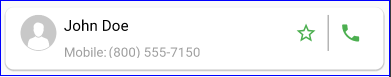
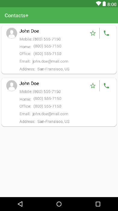
Let’s try these attributes on contact_item.xml layout which defines the layout of each individual contact item in our Contacts+ app. Below you can see the preview and current XML code for this layout.

contact_item.xml>contact_item.xml>Please pay attention to tools:text attributes in <TextView>elements and tools:src attribute used in <ImageView>element. We are using these attributes because all data will be retrieved from DB or API during the runtime and displayed in relevant view elements. Without tools attributes our card item will look like this:
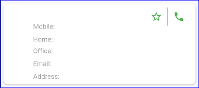
contact_item.xml> without tools attributesPretty confusing. Right? So, using tools: prefixed attributes allows us to visualize data in layout preview and test our layout more precisely.
We can also use tools: prefixed attributes to unset an android: prefixed attributes only for the layout preview. For example, let’s say that we want our contact items to show only contacts’ name and mobile number and reveal other secondary data through expanding on user click. To enable this feature, I will just set <CardView>’s height to 80dp and add onClick listener to expand it and reveal the secondary information.
contact_item.xml> with 80dp heightAs you can see, after setting the height to 80dp we are no longer able to see the secondary fields in layout preview. However, it is very easy to fix this problem. We just have to add tools:layout_height=”wrap_content” into our <CardView>. This also means that it is allowed to use both the android: namespace attribute (which is used at runtime) and the matching tools: attribute (which overrides the runtime attribute in the layout preview only) simultaneously on the same view element.
tools:context
This attribute declares which activity this layout is associated with by default. This enables features in the editor or layout preview that require knowledge of the activity, such as picking the right theme to show for a layout, rendering the action bar (which is associated with the activity), a place to add onClick handlers, etc.
In the example of our app, we will add this attribute to the root tag of our contacts fragment, to inform that this fragment will be added to the main activity.
<RelativeLayout
    xmlns:android="http://schemas.android.com/apk/res/android"
    xmlns:tools="http://schemas.android.com/tools"
    android:layout_width="match_parent"
    android:layout_height="match_parent"
    tools:context=".ui.activity.MainActivity">
tools:layout
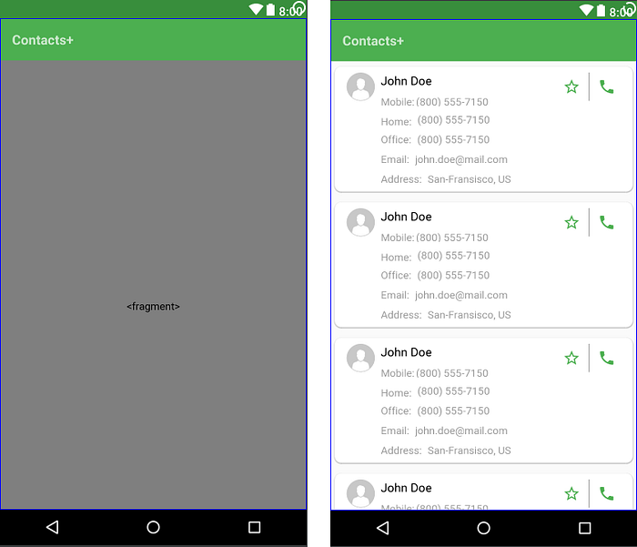
This attribute is used only by <fragment> tags and informs editor about the layout that should be drawn by layout preview inside the fragment. Below you can see the difference between layout previews of our activity_main.xml layout before and after adding tools:layout=”@layout/fragment_contacts” to the <fragment> tag.
activity_main.xml> before and after adding tools:layout to the <fragment> tagtools:showIn
This attribute is used to point to a layout that uses this layout as an include and refers to it through the <include> tag. This allows you to preview and edit that file as it appears while embedded in its parent layout. For example, adding tools:showIn=”@layout/activity_main” to the root tag of our contact_item.xml will force the editor to redraw our layout within the main activity:
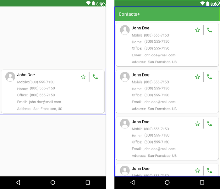
contact_item.xml> before and after adding tools:showIn attributetools:listitem | tools:listheader | tools:listfooter
These attributes are intended for <AdapterView> (and its subclasses like <ListView> and <RecyclerView>) and used to specify the layout that should be drawn inside that adapter as a list item, header or footer. For example, fragment_contacts_xml layout of our Contacts+ app declares <RecyclerView> and this is how it looks like before and after adding tools:listitem=”@layout/contact_item”:

fragment_contacts.xml> before and after adding tools:listitem attributetools:itemCount
This attribute is intended solely for <RecyclerView> and used to specify the number of list items the layout editor should render in the layout preview.
As per my observations, by default Android Studio shows 10 list items for <RecyclerView>. Therefore usually after adding tools:listitem attribute the <RecyclerView> covers the entire layout screen and you can no longer see other view elements below it. In such cases tools:itemCount attribute will help you to see the elements below the <RecyclerView>.
fragment_contacts.xml> after adding tools:itemCount attributetools:menu
This attribute is used to specify the menu layout that should be shown in the app bar. Menu layouts should be added without @menu/ or any other ID prefix and without the .xml extension.
After adding tools:menu=”main” to the root tag of our activity_main.xml we will start to see the menu icon in the app bar:

activity_main.xml> after adding tools:menu attributeAccording to the official documentation, it is also possible to pass in multiple menu IDs, separated by commas. However, passing multiple menu items won’t have any effect in the layout preview.
tools:openDrawer
This attribute works exclusively with <DrawerLayout> and allows to control its state (open, closed) and position (left, right) in the preview pane of the layout editor. Below table list names and descriptions of constants that this attribute accepts as the parameter:
For example, below code will enable you to see the <DrawerLayout> in open state in the preview pane:
<android.support.v4.widget.DrawerLayout
    xmlns:android="http://schemas.android.com/apk/res/android"
    xmlns:tools="http://schemas.android.com/tools"
    android:id="@+id/drawer_layout"
    android:layout_width="match_parent"
    android:layout_height="match_parent"
    tools:openDrawer="start" />
tools:minValue | tools:maxValue
This attributes set minimum and maximum values for a <NumberPicker> in the preview pane of the layout editor.
For example:
<NumberPicker
    xmlns:android="http://schemas.android.com/apk/res/android"
    xmlns:tools="http://schemas.android.com/tools"
    android:id="@+id/numberPicker"
    android:layout_width="match_parent"
    android:layout_height="wrap_content"
    tools:minValue="0"
    tools:maxValue="10" />
"@tools:sample/*" resources
This is one of the most useful attributes that allows us to inject placeholder data or images into our views. Currently, Android Studio offers following types of predefined data that can be injected into our view elements:
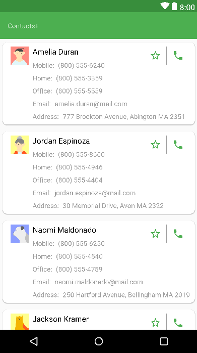
In case of Contacts+ app, these predefined data will allow us to visualize the name, surname, phone number, address and even the avatar of contacts without using the hard-coded texts and image resources.
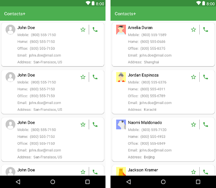
contact_item.xml> before and after adding "@tools:sample/*" resourcesPretty neat, huh?! 👍
Our layout looks now more realistic. However, since there is no predefined data for email addresses, we are still using the hard-coded text for displaying it. Also, instead of a full address, we are just using the "@tools:sample/cities", which shows only city names. The good news is that Android Studio 3 now enables us to create our own predefined sample data.
Sample Data
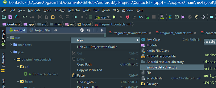
To declare and use our sample data, first of all we need to create a sample data folder. To do so, we have to right click on the app folder then press New -> Sample Data directory.
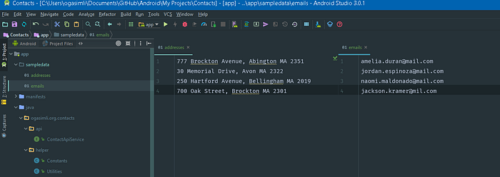
After that, you will notice the new folder called sampledata under the app. Now we can put our data inside that folder. At that point we have two options:
- Add plain text file, insert raw data line by line and then reference that data using
"@sample/fileName". In case of our app, we will create two different files (emails&addresses) and insert email and address data inside that files. Then we will reference that data from our contact_item.xml usingtools:text=”@sample/emails”andtools:text=”@sample/addresses”.
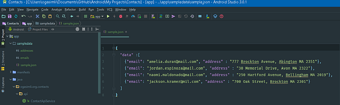
- Create one file containing all data that we need in JSON format and reference that data using
“@sample/fileName.json/arrayName/fieldName”. This option should be preferred over the first one in case you have a complex data. For our Contacts+ app, we can create a file namedsample.jsonwith below content and reference the fields viatools:text=”@sample/sample.json/data/email”andtools:text=”@sample/sample.json/data/address”.
🎉 🎉 Congratulations! 🎉 🎉
We have made a very impressive work and after all changes, our app looks very clean and realistic.
Hope you found this story useful and interesting. Feel free to share your feedback and comments and don’t forget to clap 😃.
Happy coding!

